Alert
Overview#
Alerts display a prominent message and related optional actions.
| Component | Pattern | User action |
|---|---|---|
| Message | Low priority | Optional: Messages disappear automatically |
| Alert | Prominent, medium priority | Optional: Alerts remain until dismissed by the user, or if the state that caused the alert is resolved |
| Modal | Highest priority | Required: Modals block app usage until the user performs an action or exits the dialog (if available) |
Design Guidelines#
Use when#
- A message of medium priority must be displayed to a user.
- A contextual, focused action is required of a user.
Dont use when#
- You need to display large amounts of feedback information within a user flow.
- A decision must be made that impedes the flow of the app. Use an Alert Modal instead.
- You are trying to provide users with low priority, at-a-glance feedback. Use a Message instead.
Editorial#
- The Alert message should communicate a change or error within an app.
- Be clear. Alerts communicate a succinct message and what will happen if users interact with them.
- Be focused. Alerts contain a single message and specific actions a user can take.
- A link within an Alert should directly relate to the Alert’s message and clearly represent the action.
Behaviour#
- Alerts are persistent and non-modal, allowing the user to either ignore them or interact with them at any time.
- Alerts are interruptive, but their level of interruption should match the information they contain and the context in which they appear.
- Only one Alert should be shown at a time.
- An Alert should require a user action to be dismissed (either with the dismiss "X" icon or through an action).
- If the Alert has an action that must be resolved, a "X" icon should not be included.
- If the Alert is at the same elevation as content, it pushes content downwards.
Actions#
- Actions within Alerts should be presented as underlined text.
- Only one action should be displayed at a time.
- Actions should be in-line with the Alert message and should wrap with text.
- Actions should follow Alert message.
- Clicking the link should resolve and close the Alert.
Visual Style#
- Can be used within page headers, cards or modals.
- Alerts should be displayed at the top of of the window or card.
Accessibility#
- Any action added to the Alert should include the appropriate alt-text .
- Colour contrast should meet AA standards.
Examples#
Preview examples in Storybook
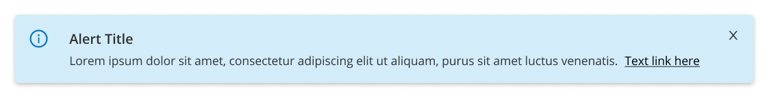
1. Information#
Used to convey a general message or feedback within a page or card.
*Storybook example to be added here.
2. Success#
Used when an action has been completed with a positive outcome for the user.
*Storybook example to be added here.
3. Warning#
Used when alerting a users attention to a possible issue or action. This alert should provide guidance on how to avoid further possible issues.
*Storybook example to be added here.
4. Error#
Used when an action has been completed with a negative outcome for the user. This alert should provide guidance on next steps on how to resolve the issue.
*Storybook example to be added here.