Error and Warning Messages
Error messages#
The implementation of error states and corresponding messaging can vary by scenario. It is important that all error messages be visible, understandable and useful to users.
All error messages should:
- Communicate what happened. Explain how to fix it. If the solution is known, provide a quick-fix. If the solution is not known, provide troubleshooting instructions.
- Be displayed in close proximity to the issue.
- Use the right color and tone of voice to communicate severity of the issue.
- Use language understood by users and avoid technical jargon.
- Be concise.
Before designing for an error state, take a step back and think whether the error state can be prevented in the first place.
Choosing error and implementing error types#
Error messages can be delivered by a variety of components. When choosing the right error component and message think about:
- The scope of the error
- Is there something wrong with all of Hub? (connectivity issues)
- Does the error apply to the entire page?
- Or a specific element on the page?
- Is there a delay in receiving the error or is it immediate?
- Is the validation server-side or client-side or can it be both?
- Is the validation real time or on Submit or can it be both?
- Is the cause of the error still visible to the user in the viewport?
- Was the cause of the error on another page?
- Did the user navigate away and come back?
- Is the error on the existing page but out of sight? far down the page?
- How severe is the error?
- Is the data entered invalid?
- Does it block users from continuing their task?
- Is the data valid, but we want to warn users of a consequence they might not expect?
- Is there more than one error?
- Is the error fixable by the user?
- Do we have a solution for the error?
Error message types#
Field error#

Use when
- The error applies to the input field and feedback can be provided as users type.
Field warning#
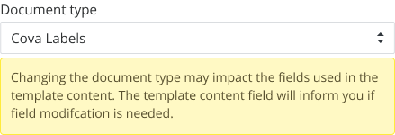
Use when
- The data entered in the input field is valid but you want to warn the user of an unexpected outcome.
Take a step back and think whether the warning state can be prevented in the first place by providing help text, link to help guides etc.
Implementation#
Component variation:
- Alert (no header)
Content:
- The message is in close proximity to the relevant field. Focus on explaining the unexpected impact of an action.
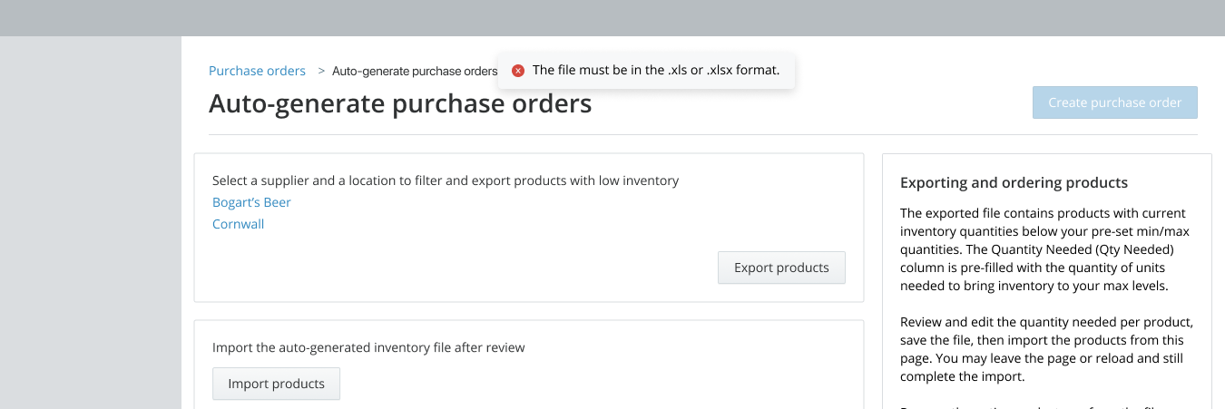
Page-level alerts (error and warning)#
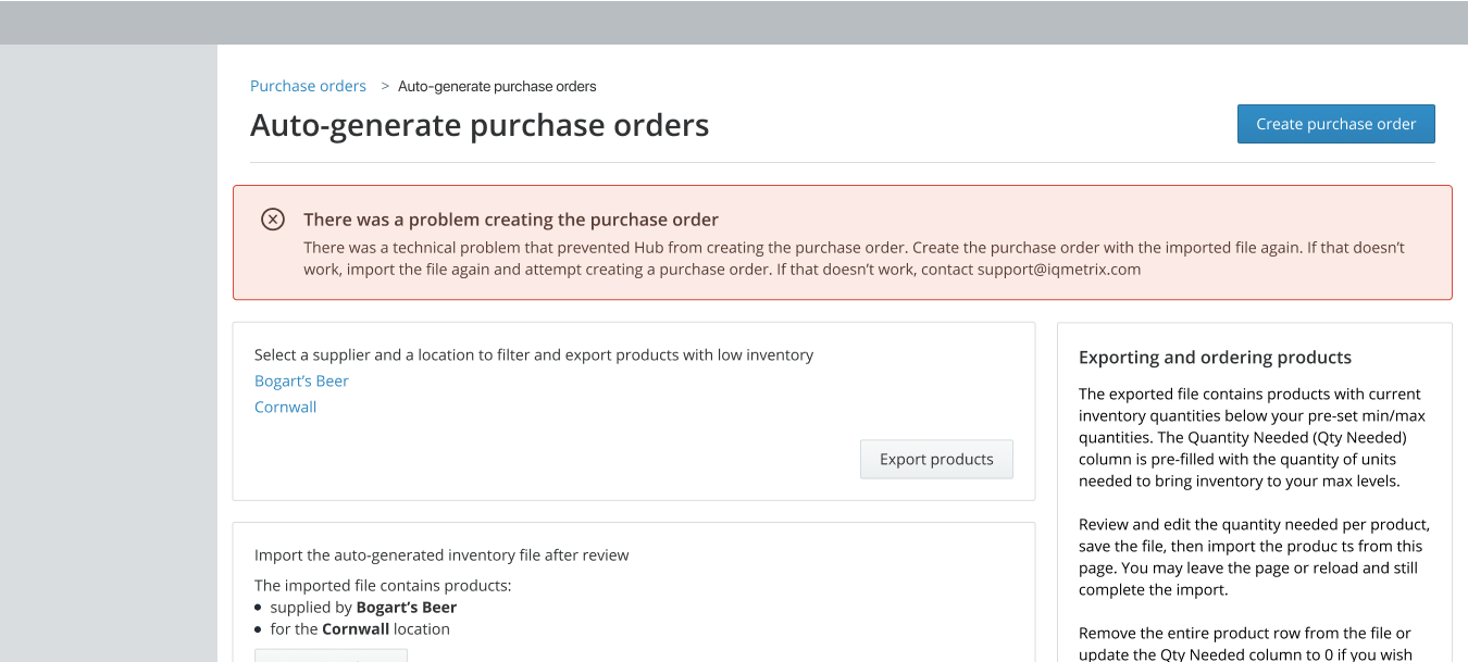
Use when:
- The error applies to the entire page.
- Multiple input field errors exist and a summary of the errors will be helpful to the user.
- There is a delay in providing the error and it's reasonable to communicate the error when the user returns to the page.
Implementation#
Page-level alerts should communicate:
- Where the error happened on the page
- What was the error
- Why the error occurred
- Next steps to fix the error
Component: Alert (with header)
Content:
- Heading: Should summarize the where, what and why of the error.
- Body: Explain how to solve the problem and provide actionable next steps for the user.
Alerts in a tab (error and warning)#
Use when
- The error or warning applies to the specific tab on a page.
Don't use when
- An error applies to the entire page.
- The error applies to a component within the tab.
- User tries to navigate to another page within the app without saving changes made within tab(s). Use a page-level alert.
Implementation#
Component: Alert (no header)
Content:
- The message is in close proximity to where the error happened. Focus on providing what, why of the error and next steps.
Alerts in a card or a modal (error and warning)#
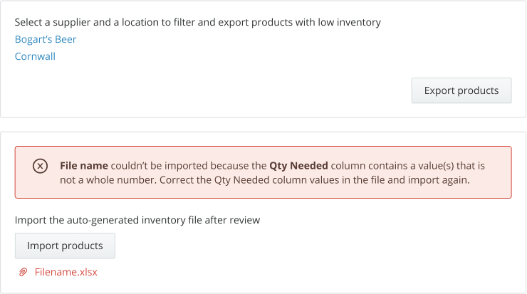
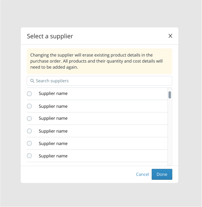
Use when
- The error applies to the specific card or card section on a page or a modal.
Don't use when
- An error applies to the entire page.
- There is a delay in providing the error. Use a page-level alert.
Implementation#
Component: Alert (no header)
Content:
- The message is in close proximity to where the error happened. Focus on providing what, why of the error and next steps.
Placement:
- Always place below the
titleand above other content in the card or modal unless alert is specific to an individual component such as inputs or checkboxes.
Hub unavailable#

Use when:
- Users can't see the entire page due to permission restrictions or 400 or 500 series errors.
Implementation#
Component:
- Result
Content:
- Headings: should summarize the what and why of the error.
- Body: Explain how to solve or troubleshoot the problem.
- Button or action: Should provide the most likely one-click solution.
No Permission Example:
- Headings: You do not have permission to view this page.
- Body: Please contact your systems administrator to request permission.
Leaving an app#
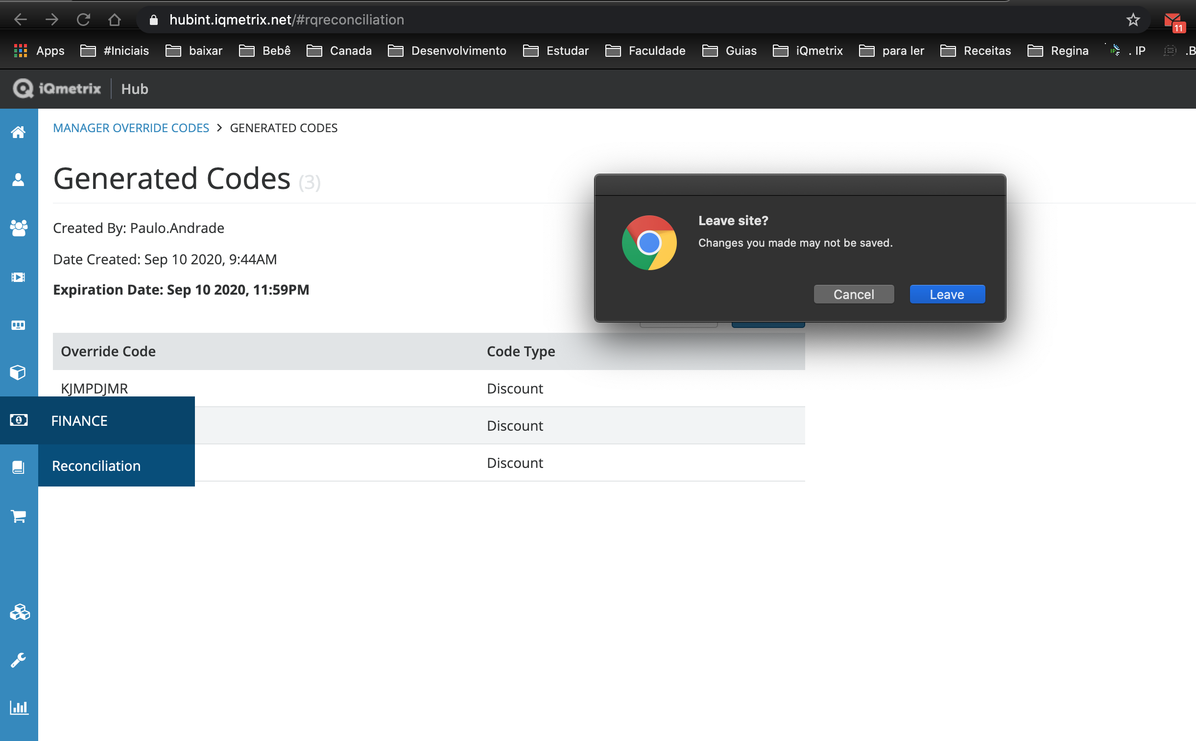
Use when:
- The user performs browser level actions e.g. pressing the back/forward/refresh button or typing in the browser address bar (URL address).
Implementation#
Component:
- Browser error default
Anti-patterns#
Avoid providing error messages in toasts and notifications pop ups#
Toasts (antD's message component)
- Toasts offer limited space to communicate what went wrong and how to fix it.
- Toasts disappear after a certain duration and can be missed by the user.
- In some scenarios, toasts can be used to provide errors that are not the user's fault.
Notification pop ups (antD's notification component)
- Notifications separate the error message from the source.
- Don't allow errors to persist.
- Always use an alert to inform users of a persistent error message.
Don't use modals for error messages#
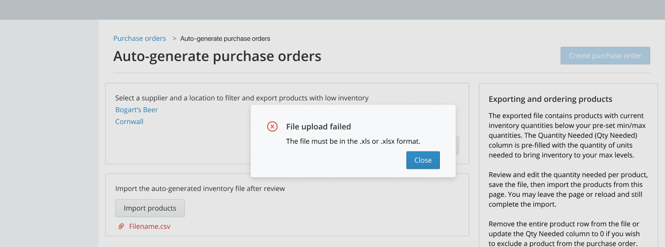
- Modals obstruct the user until decision is made.
- Once closed, the error message is no longer in sight. Users need to remember what went wrong and how to fix it.
- Modals are a good way to ask for confirmation on destructive actions but not a good way to communicate error messages.
Error colors#
(coming soon)
Validation in forms#
When forms are used to save data, always validate the entire form on submit. In some cases, validation on form submit can be enhanced by validating input fields as users type.
Validate on (form) Submit#
| Pattern | |
|---|---|
| 1 | Use loading states of components to indicate form submission is in progress. Don't change invalid data for the user.  |
| 2 | If a single error return - Bring the field into the viewport - Focus on the field - Show an error message below or in close proximity to the field. 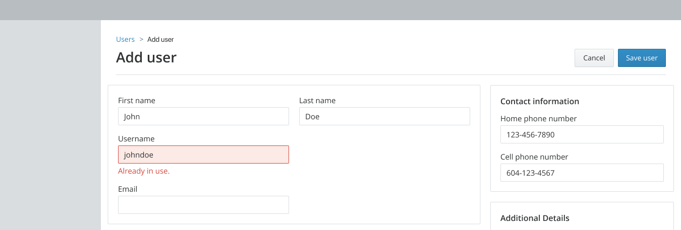 |
| 3 | If multiple errors are returned - Scroll the viewport to the top of the page - Use page-level alert to display a summary of all the errors - Show an error message below each field 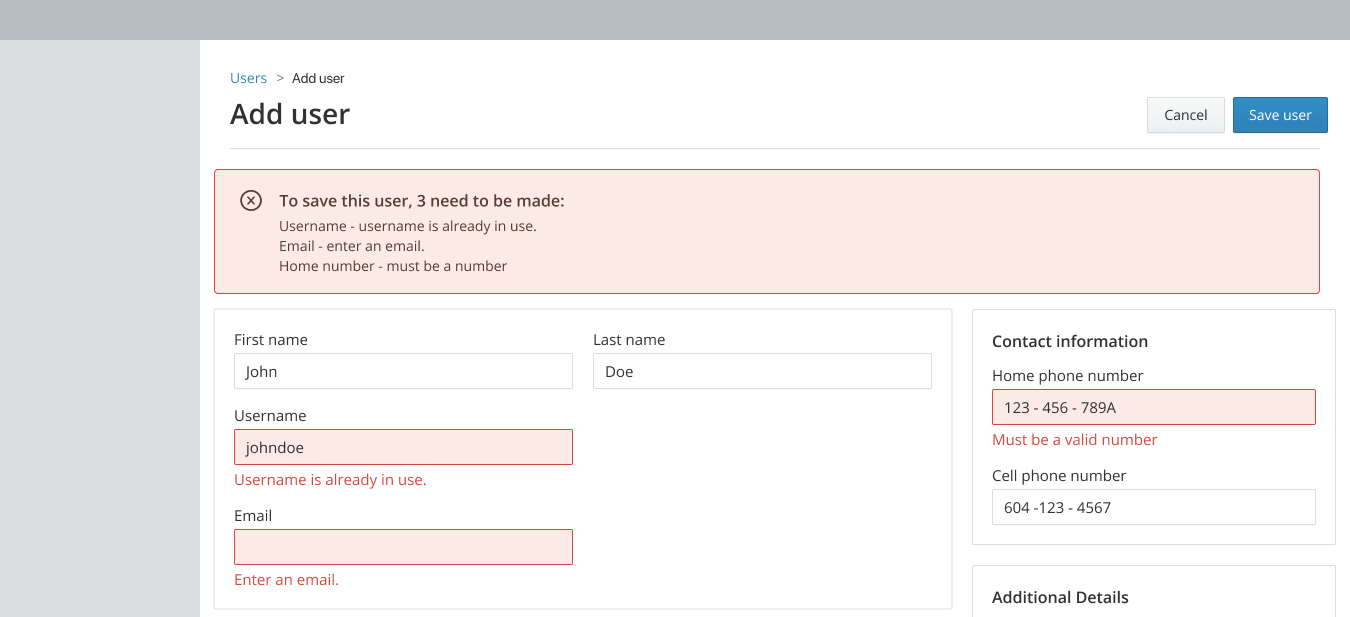 |
Use when:
- Not all form options can be validated as users type. For example, a required but untouched input field or radio button cannot be marked as invalid until the user submits a form.
- It takes more than 1 second to validate the data in an input field or other component. This is often the case when server-side validation is required.
Don't use when:
- A form has no formatting or validation requirements and doesn't save data.
Component:
- Alert
- Input
- InputNumber
- Checkbox
- Radio button
- Select
Content:
- The message is in close proximity to where the error happened. Focus on providing what, why of the error and next steps.
Validation while user types or real-time validation#
| Pattern | |
|---|---|
| 1 | Do an initial validation check as soon as users finish typing in the field. Users can be considered to be finished typing only when keyboard focus moves away from the field and there is at least one character in the field. This helps avoid marking the field as invalid before users are really done typing.  |
| 2 | If the validation check fails, show an error message below the field (or in a persistent tooltip if the input is in a table).  |
| 3 | Once a field has an error, complete validation checks after each keystroke.  |
| 4 | Remove the error message as soon as the input becomes valid so users can immediately tell they fixed the issue.  |
Use when:
- The data entered in an input or text field must be formatted in a specific way and it takes less than a second to validate and communicate the format. Formatting can usually be validated client-side and can be done real-time.
Don't use when:
- It takes more than a second to validate and display error message. A delay greater than a second may be missed by users as they move their focus elsewhere. Either find a way to shorten validation or validate on form submit.
- A field is empty.
Component:
- Input
- Input Number
- Select (in some cases)
Content:
- Since the message in close proximity to the field, explain what the error is, not where it is.
- Short sentence of 3-5 words.