enable-disable
id: enable-disable
title: Enable/Disable#
Intro#
There are multiple scenarios where we need to enable or disable, including managing users for an app or product, locations for an app or product, and app-level settings and configurations. There are scenarios where users need to complete this action for a single item and others where a user needs to complete the action for multiple items. This pattern does not apply when turning a product or app on or off.
Language#
Please see Enable/Disable vs On/Off.
Usage#
Enable or disable a single item within a form.
- Use the Radio Button component.
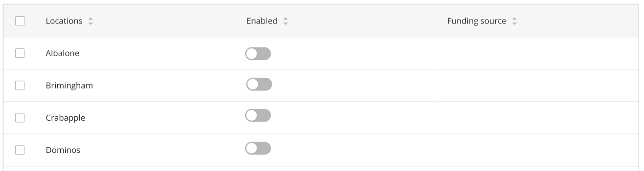
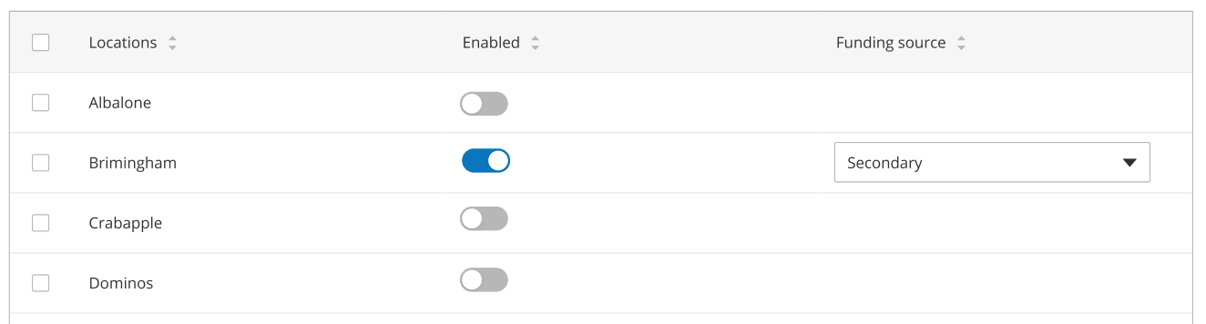
Enable or disable a single item within a table.
- Use the Switch component.
- The disabled state displays with the switch to the left and coloured grey.
- The enabled state displays with the switch to the right and coloured blue.
- The switch column should be ordered before any dependent editable columns, if there are any.
A table with inline enable/disable, all rows disabled:
Enable a location to display the dependent editable column:
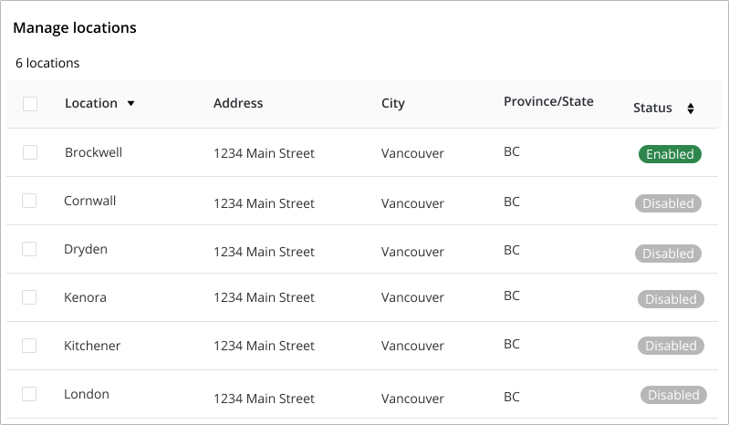
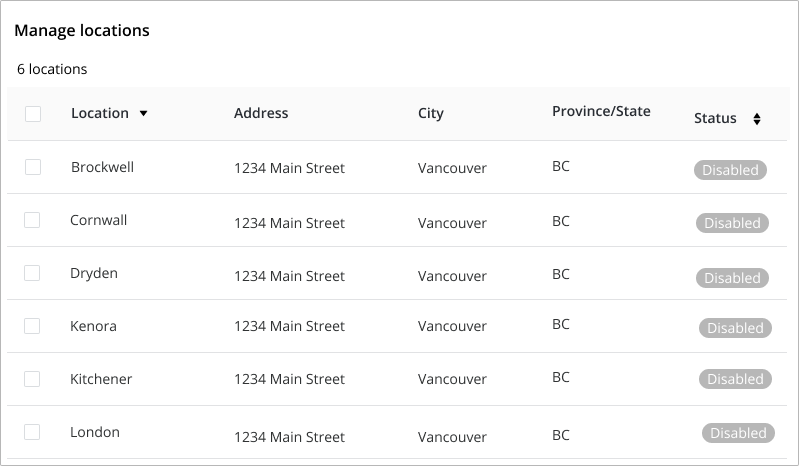
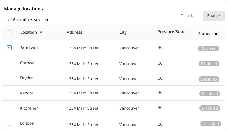
Enable or disable multiple items within a table.
- List all like items that can be enabled or disabled in a table.
- Primary column (farthest left) should list the name of the item.
- Secondary column data should provide the user with the necessary information to ensure they can identify the item they wish to enable or disable.
- If there is required data to enable or disable an item, that data should be visible in a column.
- If the required data is missing and the action cannot be completed without it, the checkbox should be disabled until the necessary data has been added.
- Once a single checkbox has been selected, the enable / disable buttons are displayed.
- The disabled status is displayed as a grey badge.
- The enabled status is displayed as a green badge.
All locations disabled:
Select a location and click enable or disable:
Selected location is now enabled: