Empty States
Intro#
Empty states are messages that appear whenever a page or component has no content to display to the user. They can appear anywhere across our products. They can alert users to empty search results, unconfigured features or can even appear to tell users that an empty area has been intentionally left blank. An empty state should never feel empty.
Usage#
An empty state is a way to communicate to users why they are seeing a page with no content to display.
Use empty states to:
- warn the user when data is unavailable
- prevent confusion that would arise from and empty page or component (dead-end)
- reassure users that they are doing the right thing
- provide context, direction and clarity to the user
- help the user figure out what they can do next
Parts#
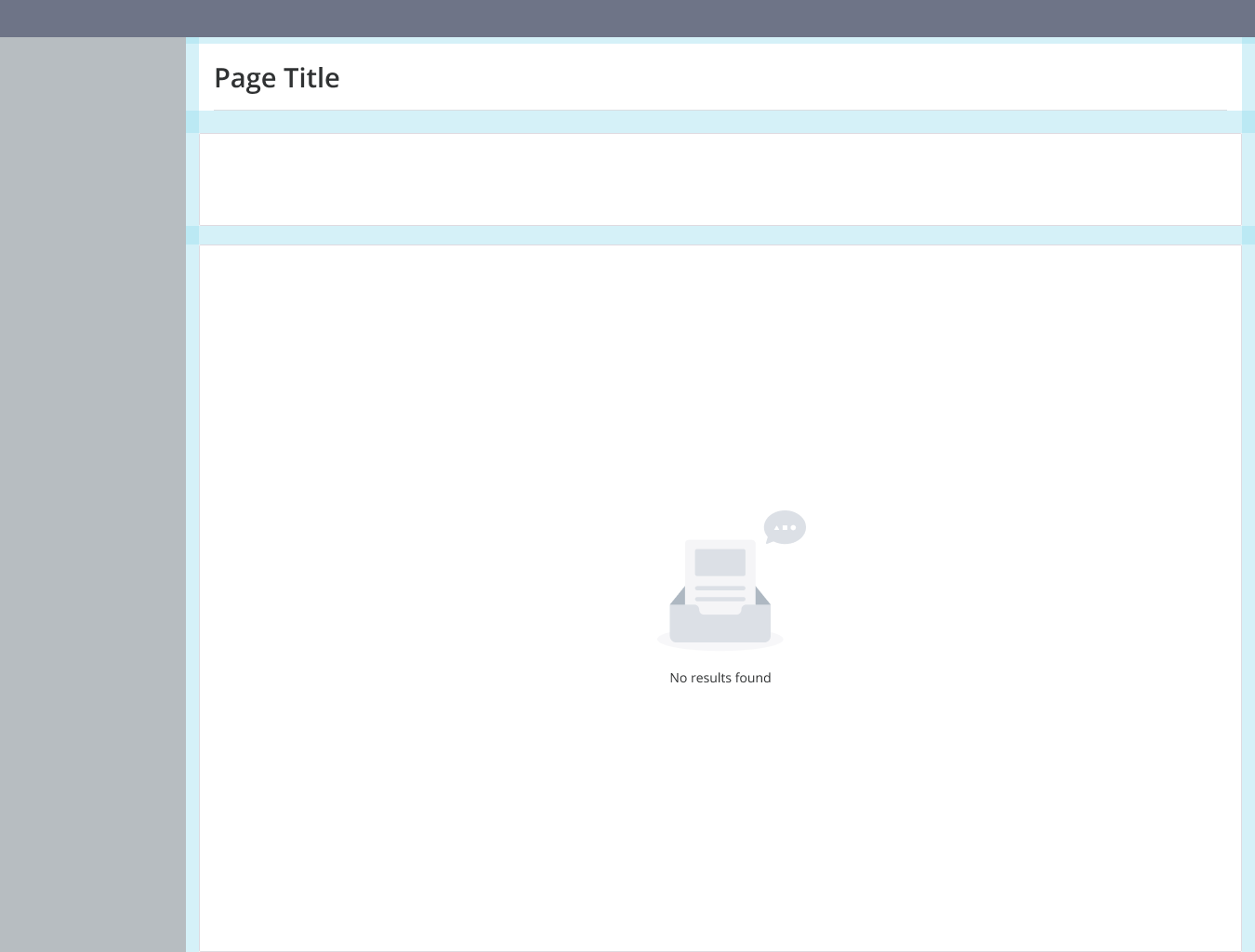
An empty state is made up of the visual (image/illustration) and message.
Message#
An empty state message consists of a short title which conveys information that is simple and clear (limit message to a few words). Always write text in sentence case (mixed-case style in which the first word is capitalized) and center aligned to image. Where possible a content library table will provide designers with message options to maintain message consistency.
Visual#
Use the default image. Size of the space for the empty state should guide the size of image. If space is limited, use text only. Images should be center aligned.