UI layouts
Common ways to arrange content on the screen.
The UI#
The UI is the entire screen of an application at any given time.
The Hub user interface consists of various layers. The Hub Shell makes the outer layer of the screen that "wraps" applications. The App Space is the inner layer of the screen and contains individual applications.
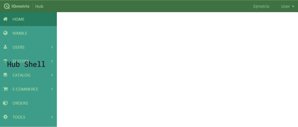
The Hub Shell#
The Hub Shell is the outer layer of Hub; it contains the global navigation and header.
The App Space#
Page layout component#
Page layout component contains all the content inside the App Space. It handles the horizontal margins and padding between the App Space and the Hub Shell. It contains the page header component and layout sections.
Page component examples
- Full-width: Used when the entire width of the App Space is needed to provide a good user experience such as for full page tables.
- Single column centred: Used when tighter screen witdh is needed to center the user's focus such as for new resource forms.
Layout sections#
Layout sections group countent Within the page layout component. Sections control how the content is prioritized and reshuffled into columns on different media queries or screen sizes.
Each layout section can be:
- Full width (100%)
- Primary (75% width)
- Secondary (25% width)
Arranging content in the App Space#
Pick a variation of the page layout comoponent depending on the horizontal space needed for the user flow.
Use layout sections to group content into columns.
- Alerts: place page-level alerts in a full-width layout section immediately following the page header component.
- Cards or tables: place in full-width or primary/secondary layout section depending on the hierarchical importance of the card.
- Page footer actions: place in a full-width section before the footer section of a page.
- Help links: place in the full-width footer section at the bottom of the page.
Arranging content in a card#
Card's have a similar breakdown as the page.
- Cards can have a header that contains the card title and card-level actions of low importance
- Cards can have a footer section that contains important card related actions
(Screenshot to come)