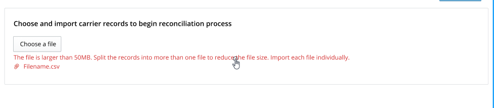
dd004_Provide an inline error message underneath the upload component button.
Question: Can we provide a more user friendly error state in the Antd Upload component?
Antd Upload component's default method of displaying errors is within a tooltip that appears while hovering over the error file.
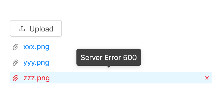
Errors displayed in non-persistent tooltips have poor user experience because:
- Messages longer than 3-5 words are displayed within a small space; possibly overlapping other UI elements.
- Messages that provide solutions to fix the errors only appear on hover, which means a user cannot see the error and fix at the time.
- It isn't intuitive nor is it popular industry practice to display error messages on hover. Avoid coupling important UX standards with framework capability.
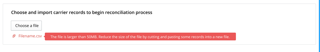
Option 1:#
Make existing error tooltip persistent with a red background.
Pro
- Minor styling and behavioural changes to the Antd Upload component.
- Error message is visible and close to the error file.
- Consistent with the way inline errors are provided in the table component.
Con
- Long messages in tooltips are written in a small space.
- A persistent tooltip can block the visibility of other UI elements on the page (such as the button component within the upload component or another file link if multiple files can be selected).
- Will require a custom work and documentation *
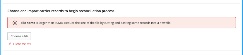
Option 2:#
Use alert component on top of the card the upload component is in.
Pro
- Content is persistent and clearly visible in the UI.
- Easy implementation; doesn't require a lot of customization.
Con
- Alert is not the component used for single inline errors.
- Alert will sit away from the upload in scenarios where the card has other ui elements.
Option 3:#
Provide an inline error message underneath the upload component button.
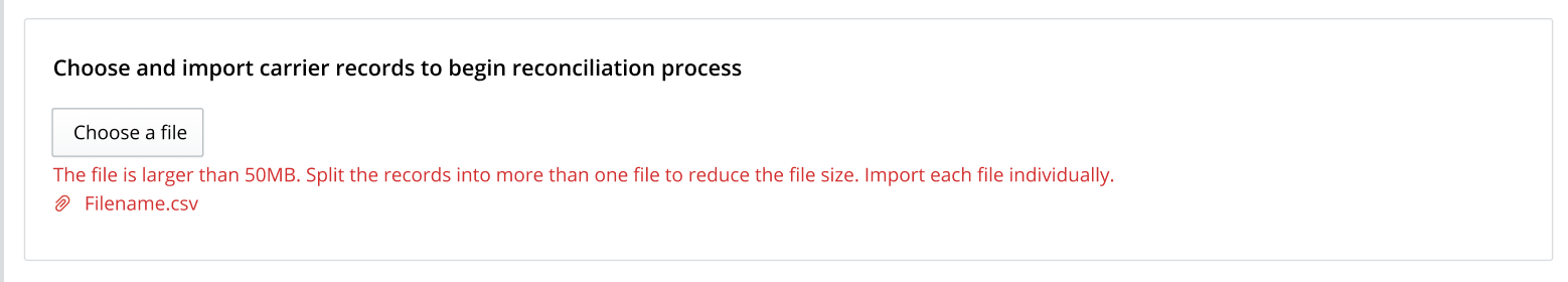
Pro
- Consistent with how we do inline errors.
- Message close to the problem.
Con
- Will require a custom work and documentation.
- The error message will be clickable and will open up the file select box.
 |
|---|
 |
Decision#
Picking Option 3 over Option 1.
- Both options require custom work
- Option 3 meets all our error implementation standards.
- Option 3 has worked for two React apps. It doesn't require teams to think through formatting or display on a per use basis.
- Option 1 would require thinking through tool tip implementation on a per use basis.
- For long messages, should the tooltip be taller or wider?
- Where on the file line should the tooltip be displayed in the UI?
Option 2 and default behaviour have been rejected.
- They both go against the error implementation standards we've set.
- Both are coupling important UX standards and behaviour with framework capability and out of the box functionality. We want to avoid coupling like this - Antd did not think the UX through on this implementation.