Table
Overview#
Display a collection of records or a dataset as rows of data.
Design Guidelines#
Use when#
- There is a collection of structured data.
- There is a requirement to sort, search, paginate, or filter data.
Don't use when#
- There will only ever be one row of data.
- There are several entries, but no reasonable columns. Use a list instead.
- If the table contains large blocks of text, prominent images, or other content that makes scanning difficult, consider a List component.
Visual Style#
- Should be placed inside a card which fills the viewport.
- Should span 100% of the remaining height and width within the card.
Cells#
- Align text to the left of cells.
- Align numbers to the right of cells.
- For numbered columns with decimals, maintain a consistent number of decimal places.
- If decimal spaces do not match between rows, pad the right of the number with
0s until the decimal aligns.
- If decimal spaces do not match between rows, pad the right of the number with
- For numbers that may have another symbol prepending them, such as dollar amounts, prepend with the corresponding symbol (
$). - For numbers that may have another symbol appending them, such as percentages amounts, append with the corresponding symbol (
%). - If content is too long to display in full, truncate with an ellipsis.
- If content is truncated, mouseover the cell should reveal a tooltip with the full text of the cell.
- Only one column of editorial text is permitted.
Rows#
- Row order is determined by the default sort column.
- When a row has multiple lines of content, top align all cell content.
Editorial#
- Use short, descriptive titles for table headers.
- Header and row identifier text must be written in sentence case.
- Table content should be scannable.
Behaviour#
General#
- Paginate if the dataset extends beyond 50 results.
- If an infinite scrolling pattern is utilized, table headers should stick to the top of the card while scrolling.
Actions#
Use for row-based actions that take place immediately when performed.
- Use the small link button.
Row identifiers#
- To provide additional context about the identifier independent of the table metadata, use a link button to open a new data-display component, often a modal.
Column ordering#
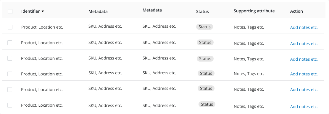
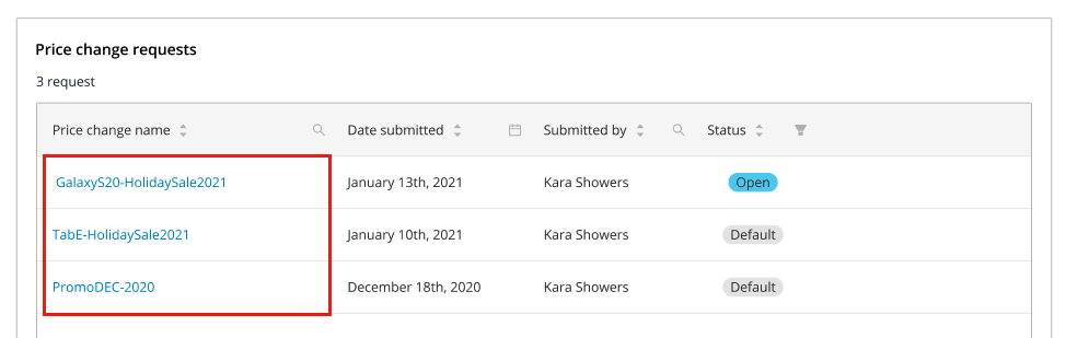
- The row identifer is always the first column on the left. Examples: Product Name, Location Name, Purchase Order Numbers etc.
- The middle rows contain metadata that provides context to the identifier. Examples: If the identifer is a product name or a location name, the metadata could include a SKU or an address.
- The last three columns should be reserved for "Status", "Actions" and "Attributes" related to the identifier.
- If there is only one status or action or attribute, most often it should be in the far right column.
- If there is a status with attributes, the status is typically in the 2nd to last column and the attribute is in the last.
- If there is a status with actions, the status is typically in the 2nd to last column and the action is in the last.
- If there is an attribute with actions, the attribute is typically in the 2nd to last column and the action is in the last.
- If there is a status, attribute and an action - use the order that makes the most sense for your specific use case.
Editing (inline)#
Use for small, quick changes that take place immediately when performed.
- Use sparingly and only when necessary.
- Do not use inline editing in place of bulk editing.
Editing text content#
Update a text field within a single table cell.
- By default, display cell content as text.
- On hover, highlight the editable state (ie. Input, dropdown, etc.).
- On click, convert the cell to the appropriate input.
- Pressing
Escon a keyboard will revert the value and reset the cell to a non-editing state, discarding any changes that the user has made. - Values can also be saved by pressing
EnterorReturnon the keyboard.
- Pressing
- Validate the input once the user has clicked off of the element or when they attempt a save action.
- Display validation errors inline.
- If the input validates, it should update the value both in the UI and in the database without requiring a page reload.
Saving an inline edit#
- When saving an a inline edit change:
- Display a message summarizing the change.
- Do not reorder the table. Leave all rows in place until the user initiates a re-sort.
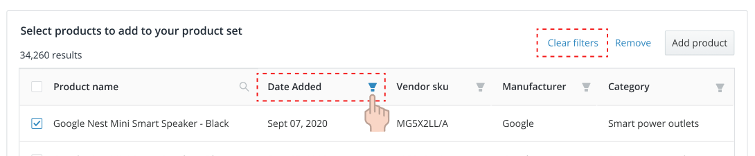
Filtering results#
- Filter is accessed via an icon on the top right of the column header.
- Once a filter has been applied, display a link button at the top of the table to clear filters.
- The clear filters button is of low priority when compared to other row-based actions.
- The clear filters button is of low priority when compared to other row-based actions.
Filter Types#
By value#
Use when a user wants to limit results to a predefined value from a data set.
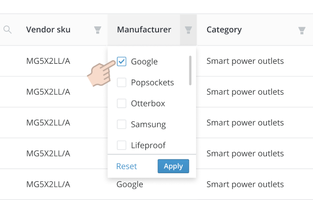
- A dropdown list will display a list of values.
- The user can make selections by pressing a checkbox within the list.
- Pressing
Applywill activate the selected filters.
By search query#
Use when a user must search through a complex dataset to find a single result.
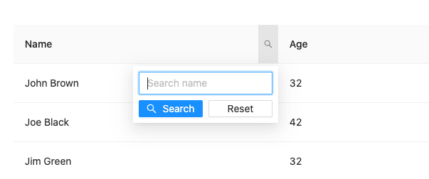
- A dropdown list will display a text entry field.
- The user can enter a string of text/numbers/characters to filter by.
- Pressing
Searchactivates the search filter. - The search input should synchonously search the column across all pages of results without a page reload.
Advanced filters#
Use the default modal for filters that require additional input options or complex data sets.
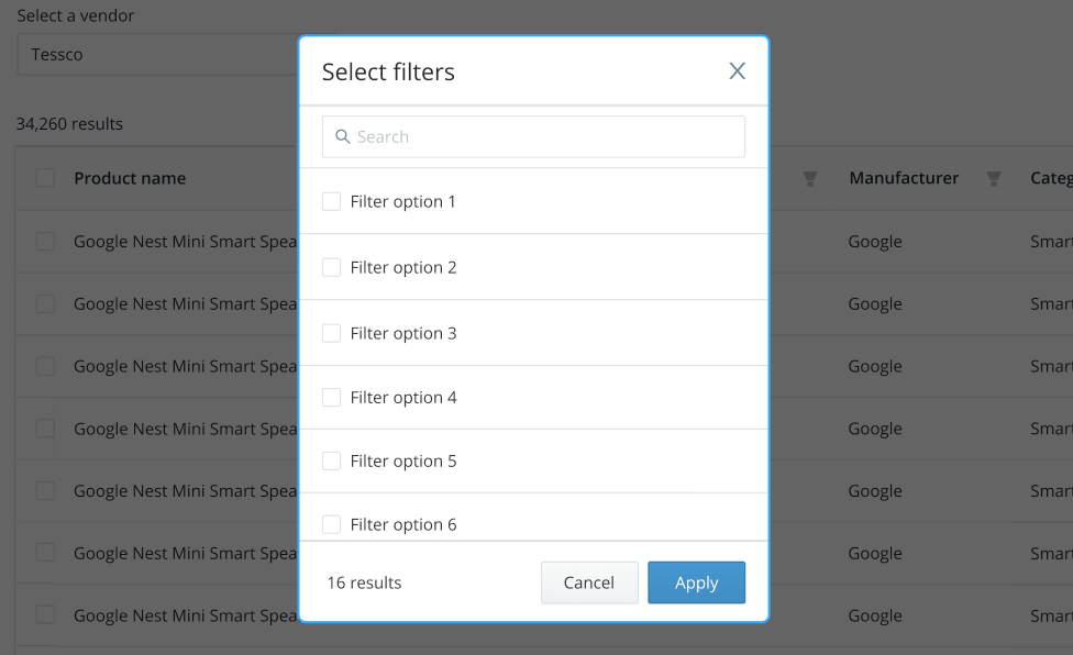
Examples include:
- A date picker.
- A date range picker.
- Selections with large datasets.
Selecting rows#
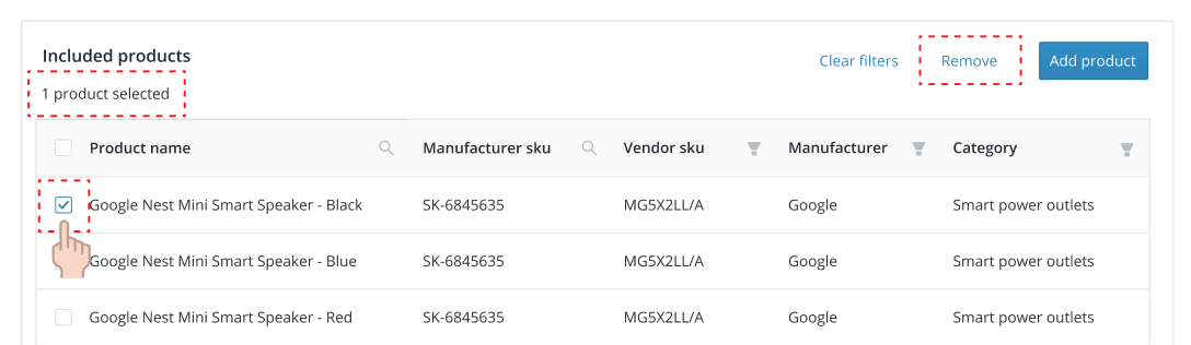
- When enabled, a checkbox for row selection must appear in the left most column.
- When a row is selected, highlight the entire row.
- Display a count of the total rows selected at the top of the table.
- When no rows are selected, the counter should display "the total number of rows" + "description of row". For example, 20 products.
- When a row type is not obvious, the word "results" should be used.
- When a row is selected, the counter should read "the number of rows selected of the total number of rows" + "description of row" + "selected". For example, 10 of 20 products selected.
- The "description of row" should be programatically changed between singular and plural as required.
- Actions that affect row content will be displayed above the table on the top right.
- Actions are hidden by default and revealed as rows are selected.
- Actions become enabled when rows are selected.
- Actions are arranged by importance, from right (primary or most important) to left (link or least important).
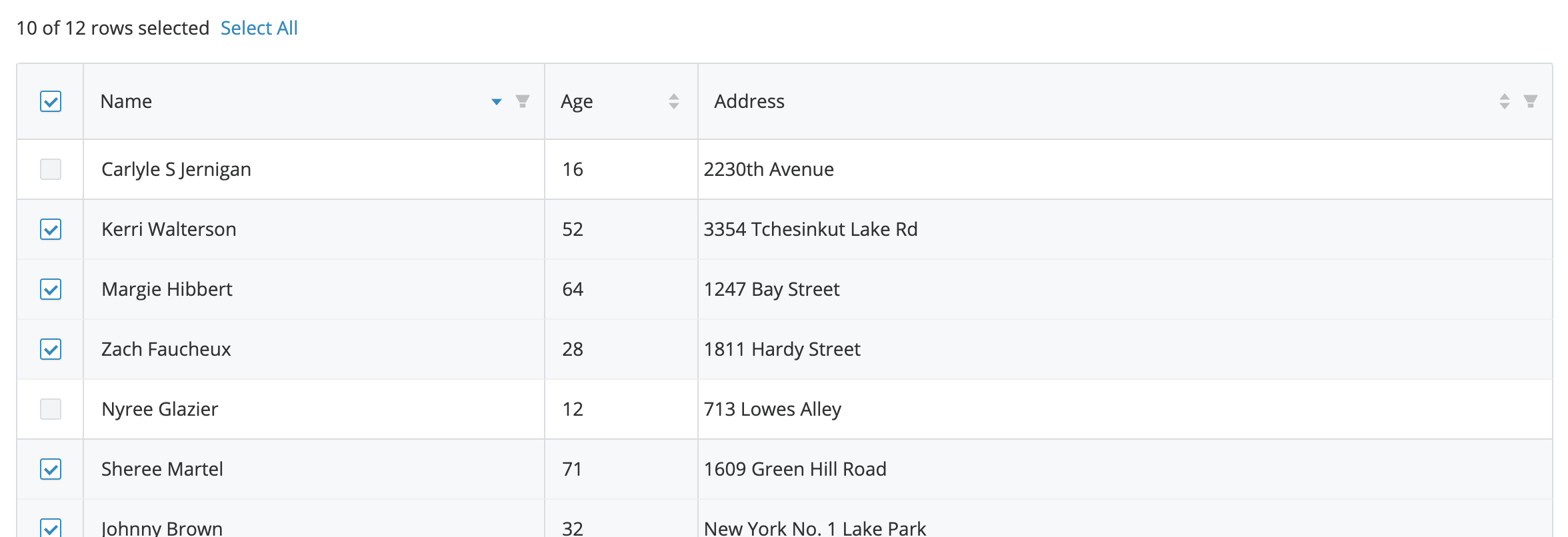
- A checkbox in the top left of the table header will select all of the rows that are displayed in the UI, not the entire set of data.
- A "Select all" link button is always visible unless all rows are disabled.
- A "Select all" link button can be used to select the entire set of data, not just what is displayed in the UI.
- If "Select all" is applied, the link button changes to "deselect all", and will deselect the entire set of data.
- If a row is disabled it cannot be selected.
Sorting columns#
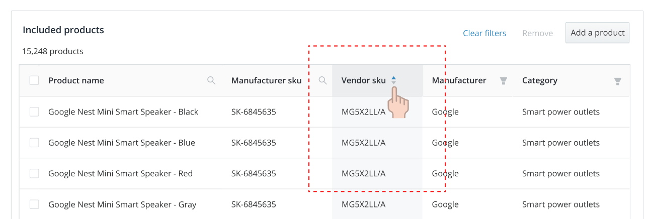
Sorting allows the user to re-orders table content based on a specified column.
- If a column can be sorted, place a sorting arrow showing the direction of the sort on the header to the immediate right of the title of the column.
- By default, a table should be sorted by ascending on the identifier column, or the first sortable column.
- Sorting actions should be conducted via a single click of the header to enable the sort state.
- The three sort states in order are: ascending, descending, neutral.
- Ascending order: Symbols (
!,", etc.) < 0-9 < A-Z. - Descending order: Z-A < 9-0 < Symbols (
!,", etc.). - Neutral is enabled when a different column is clicked for sorting.
- Ascending order: Symbols (
Examples#
Default#
The most common usage of a table.
Fixed Header#
Used when there is a large number of rows so that the user can remember what the columns mean on scroll.
Empty#
Used when a table has no data to display.
Loading#
Used when table content is loading.
Accessibility#
- Mark table headers with
<th>for better usability with screen readers. - Avoid defining cell heights. Allow a cell to expand with its content.
- Include a
captionelement to describe the table.