Dropdown
Overview#
Dropdown is used to temporarily display a single-action menu list of 4-10 pre-defined options.
Design Guidelines#
Use when#
- Displaying a single-action menu list of 4-10 pre-defined options.
Don't use when#
- Never use a dropdown for entering data in forms.
- Avoid having 10 + options in order to prevent scrolling. Consider an alternative component or reduce the number of options.
Visual Style#
- Never use any other icon besides
icon type="down"in the dropdown input. - Always place
icon type="down"to the right. - Never use icons in the dropdown menu.
Editorial#
- Always write in sentence case.
- Avoid commas, punctuation and articles (
the,an,a).
Examples
Basic#
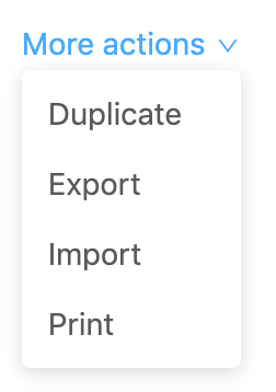
- Use to organize less important or lesser used actions in page headers such as import, export, duplicate and print. Particularly when there are too many to display directly in the UI.
Button with dropdown menu#
- Use a button dropdown to organize actions within the body of a card. Note that a dropdown should not be used to enter data in a form but as a standalone menu.
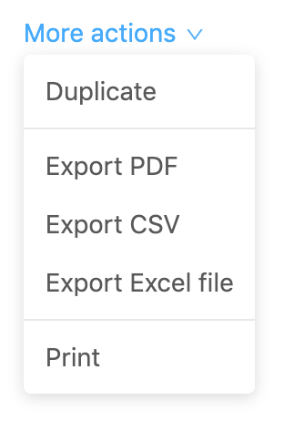
Menu with divider#
Use dividers to create sections when you have multiple groups of similar selectable options.
Behaviour
- Always disable unavailable options instead of removing them.
- Always open dropdowns on
click. - Always close menus after a menu item is clicked.
- Never change options in a dropdown based on what a user has selected on the page.
- Never open dropdowns on
hover.
Link/button
- Be clear and descriptive.
- The standard text for dropdowns in page headers is
More actions
Dropdown options
Each option should:
- Always use the
{verb}+{noun}format unless the action is clear with a single verb. - Be clear and predictable. Users should be able to anticipate what happens when they pick an option.
- Avoid unnecessary words.
Related components